ABOUT
At ABBA Girls, we are more than just a community; we are a sisterhood bound together by our love for God and each other. Rooted in the principles of Christianity, our community fosters support, care, empowerment, and love among young Christian women worldwide.
Our mission is to connect Christian girls from all corners of the globe, providing a nurturing environment where they can grow spiritually, emotionally, and socially, deepen our understanding of God's love, and strengthen our bond as sisters in Christ.
Our mission is to connect Christian girls from all corners of the globe, providing a nurturing environment where they can grow spiritually, emotionally, and socially, deepen our understanding of God's love, and strengthen our bond as sisters in Christ.


IDEATION
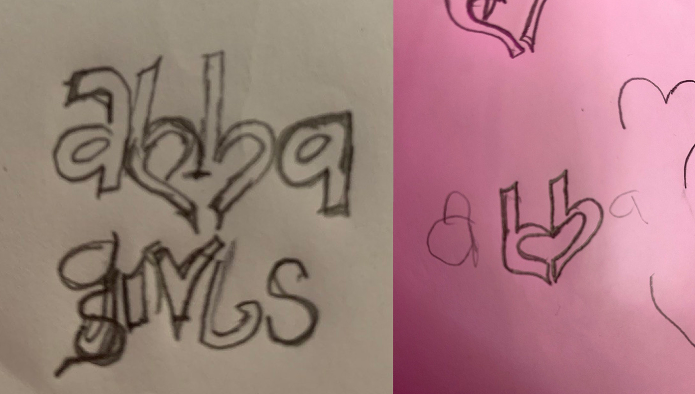
After thoroughly dissecting the brand. I was able to create a wordmark that perfectly captures the brand’s essence. I made a unique word mark that represents Christianity, community, fun, love, and sisterhood. Since Christianity is the major focus of the brand, I made sure to deviate from traditional symbols such as the cross or a dove, as the brand does not want to be perceived as a traditional Christian community. Love is at the heart of everything abba girls do, from loving God to showing support and care to sisterhood and empowerment, so I formed a heart shape with the letter b’s in the word Abba.

Patterns / illustrations
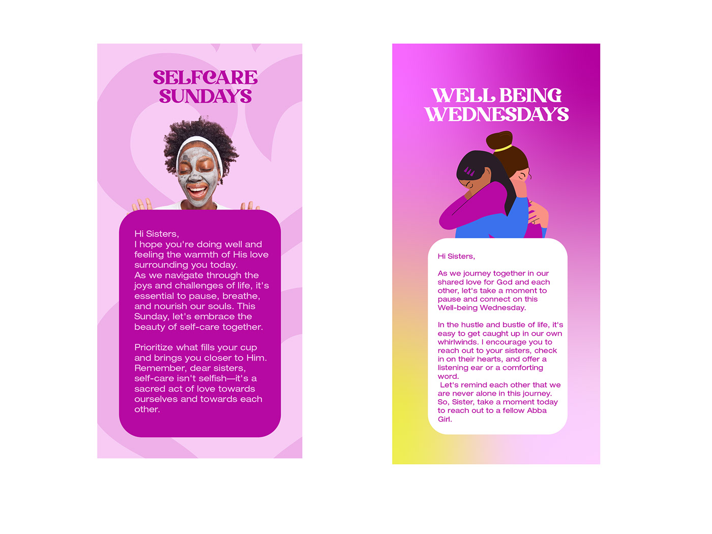
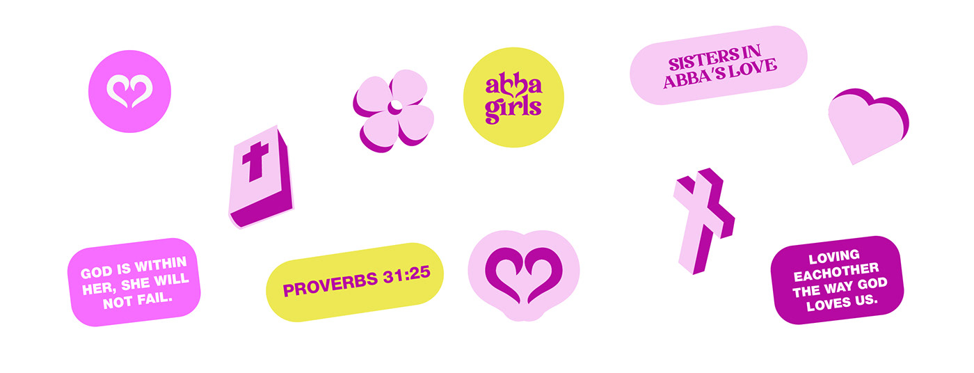
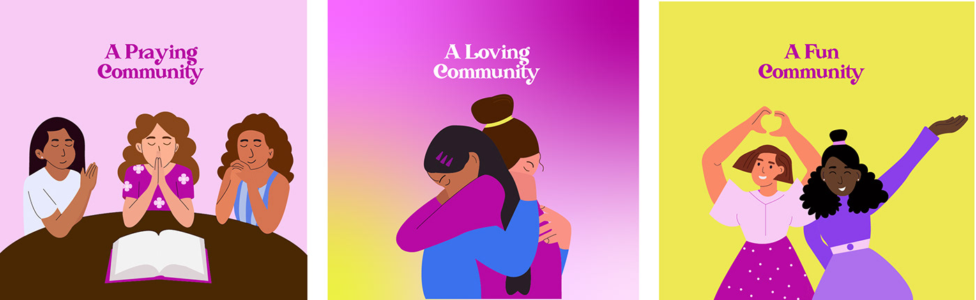
In creating the patterns and illustrations for the brand, I made illustrations to represent what the brand stands for. These illustrations and patterns can act as stand-alone visual elements and can be used on social media designs, email designs, banners, posters,
merchandise and souvenirs.
merchandise and souvenirs.


Brand words
These are brand-focused words that helped shape the creation of the entire identity.
Love
Christianity
Sisterhood
Welcoming
Young
Community
Modern
Fun
Christianity
Sisterhood
Welcoming
Young
Community
Modern
Fun